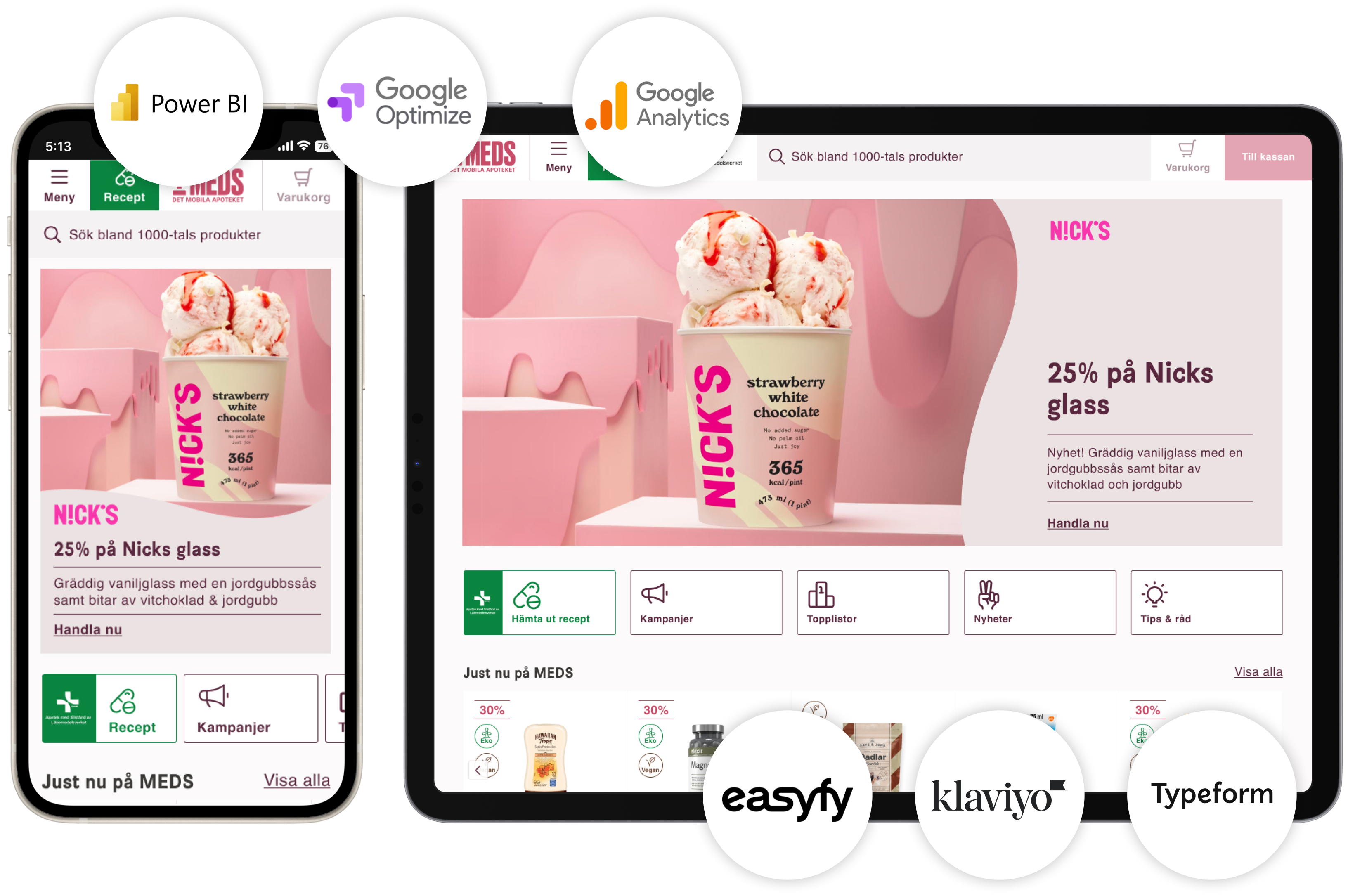
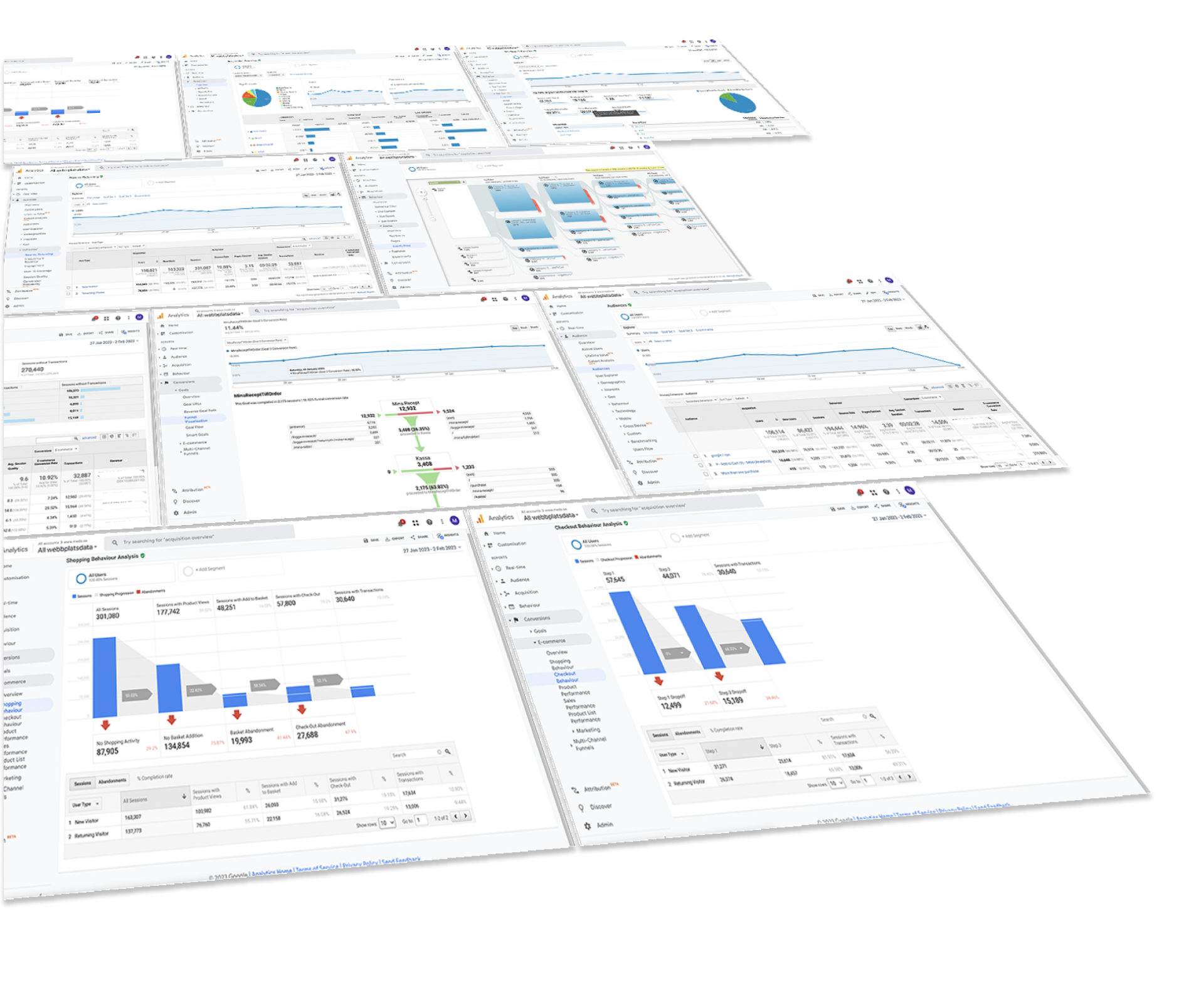
Golden opportunity with lots of data and customers to create hypotheses from. We defined the most important KPIs such as conversion, AOV, items per order, and more. We built funnels from the most visited landing pages to measure where we were losing customers. We mapped how often customers returned to site and many other data points. All to ensure that we focused on the right things when launching a new site.
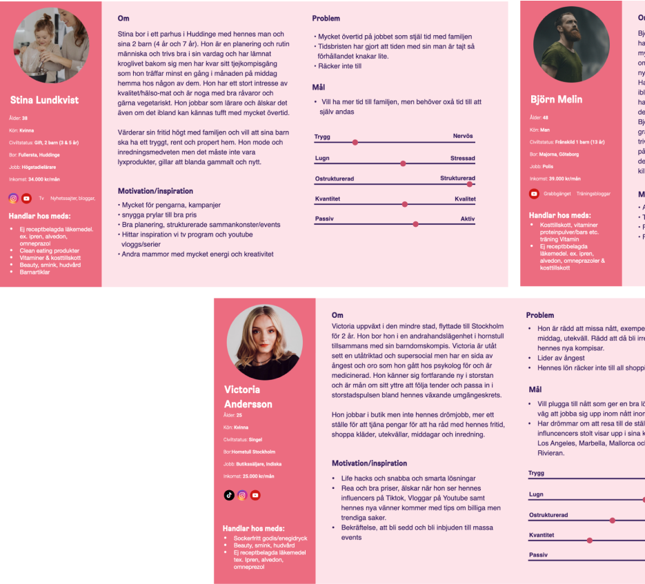
We defined insights about MEDS absolute best customer, the one who purchases prescription drugs and self-care products (with the highest order value). However, we faced a challenge with prescription drugs since there are several government regulations that prevent us from using tools like heatmaps, customer recordings, surveys, or other tools we typically use to see how UX works in reality. It was difficult to create and test hypotheses effectively.
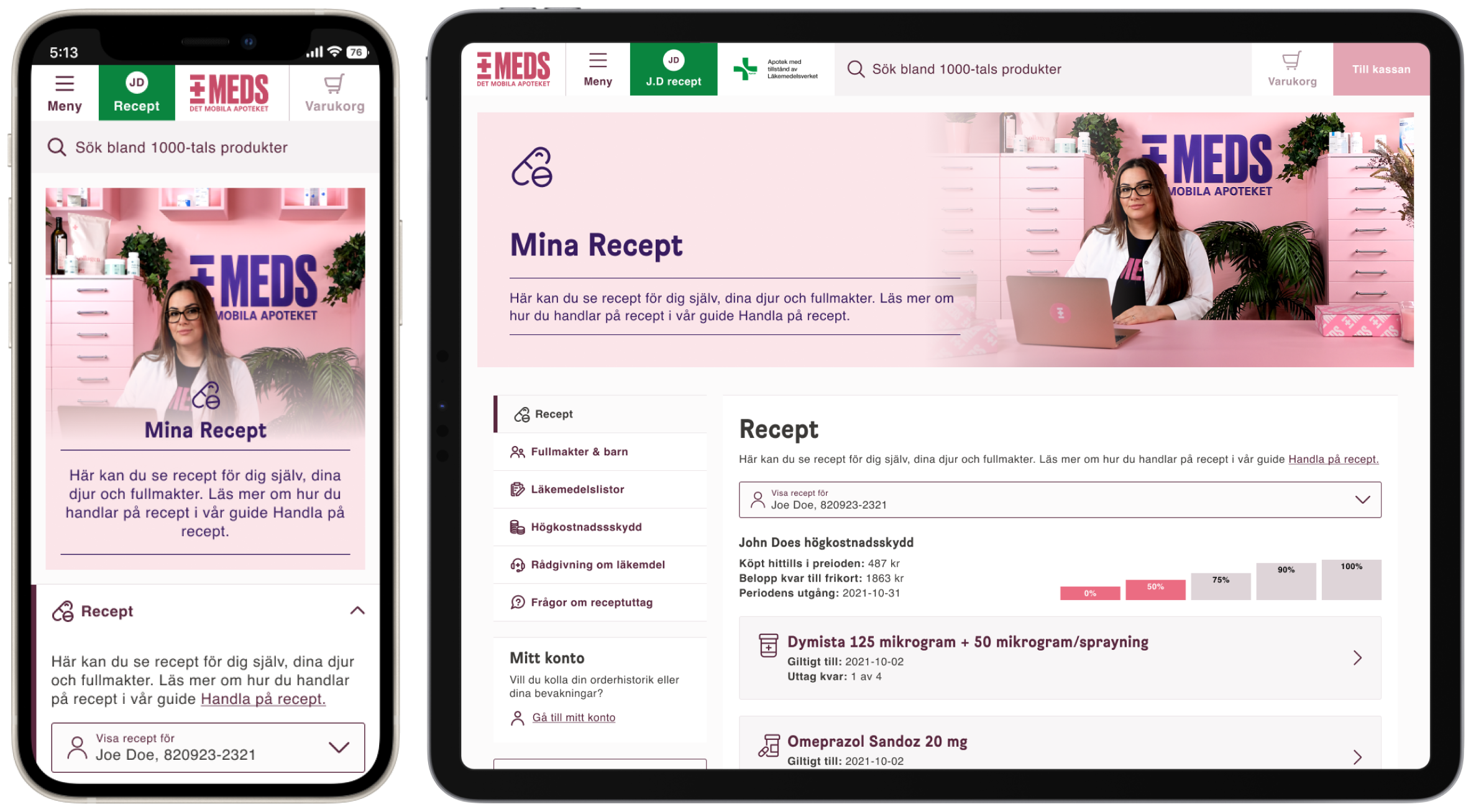
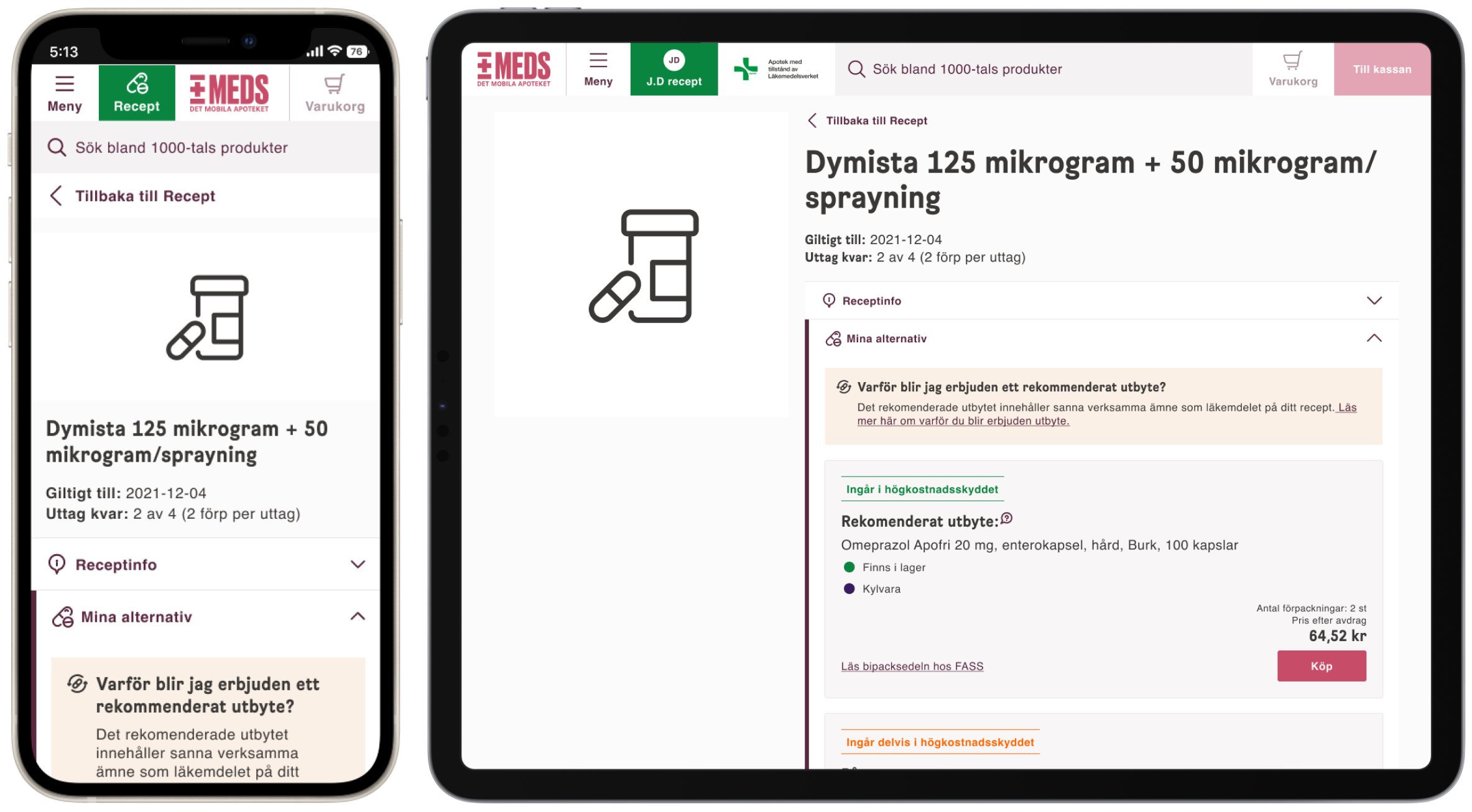
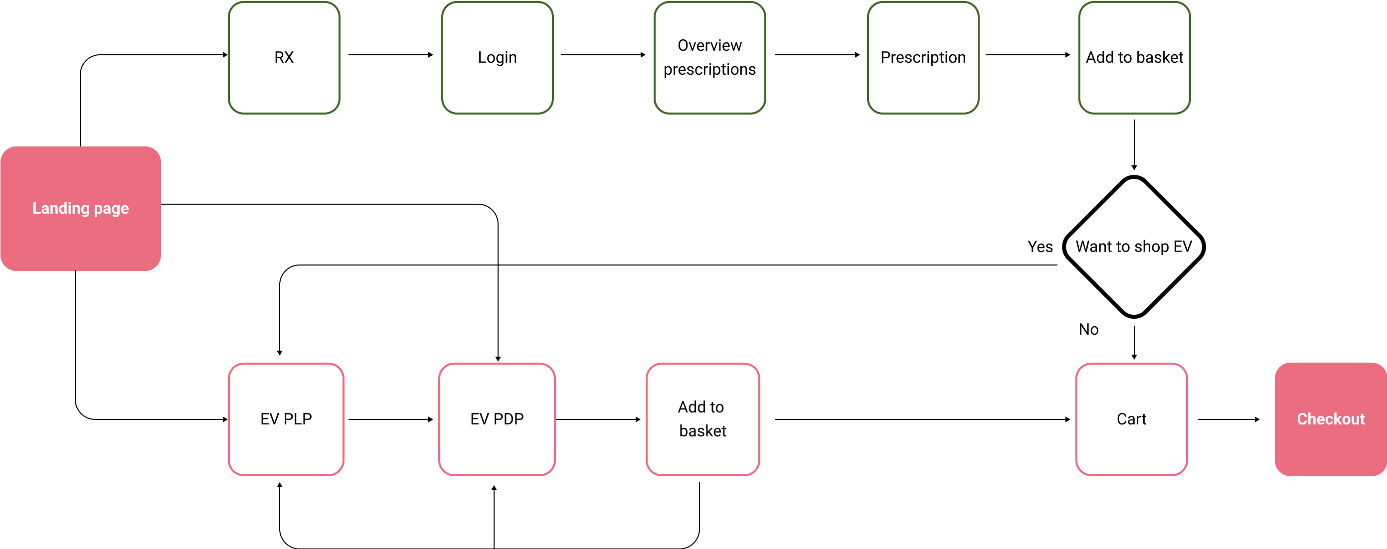
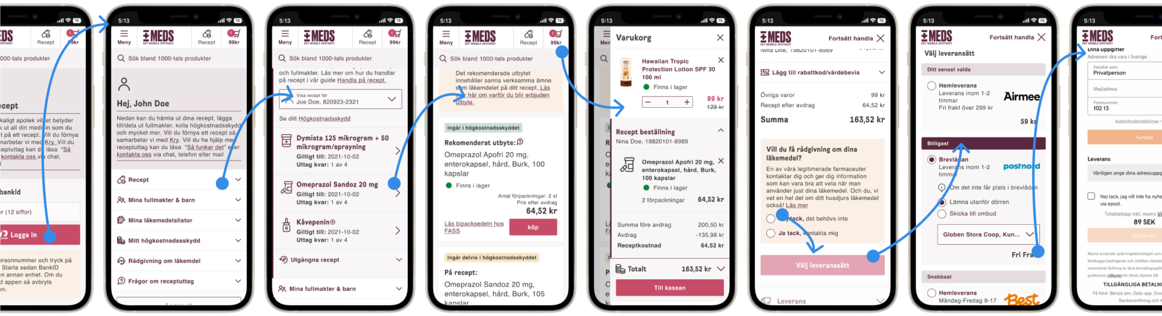
Together with MEDS pharmacists, we created several clickable prototypes that we then placed in the hands of a focus group to test the entire prescription flow. This revealed very interesting insights. Without these tests, we would have built entirely wrong solutions, costing us a lot of time and money.
From another perspective, we held workshops with all stakeholders within the organisation, including customer service, IT, procurement, marketing, and even the warehouse to identify pain points they experienced in their daily work with the site and app that they wanted to improve. A lot of information about functionality and other aspects emerged that needed to be taken into account.
We created business cases for the larger and more costly items we deemed necessary. This was to determine whether we could recoup the costs of developing them or whether we needed to scale them back and break them up into smaller steps.

.png)